
Welcome to the website of Ismail!
 Welcome back to the golden age of the internet!
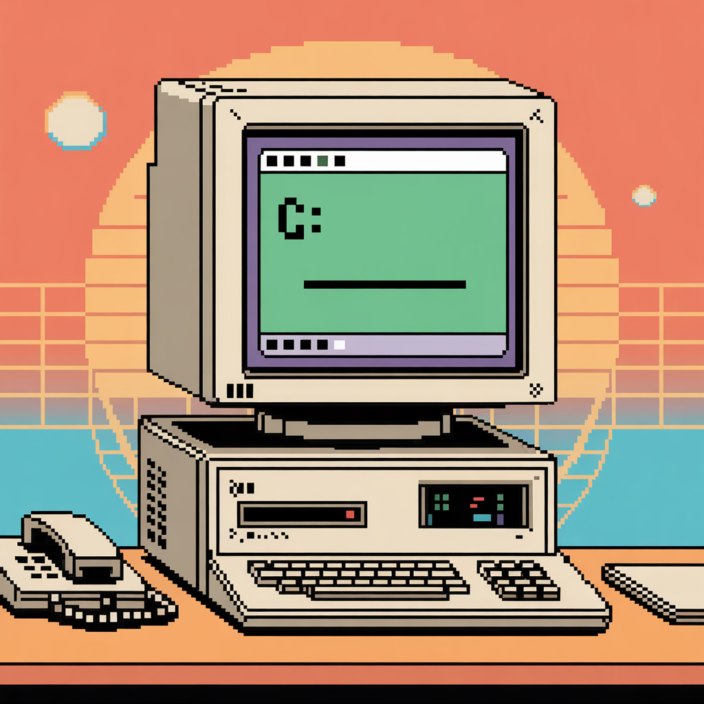
90s webpages were some of the most colourful ones. The technological constraints forced certain choices, such as using tables for page layout, as this was the time before CSS and JavaScript. As a result, people were forced to rely on HTML tricks. Some characteristics of 90s web design include:
- vibrant colours
- tiled backgrounds
- marquees or blinks
- custom cursors
- cursor effects
- Comic Sans MS
- buttons and blinkies
- gifs (lots of gifs)
Another thing I noticed was that, unlike how modern web pages take up the entire width of the screen, the 90s webpages instead used fixed width and a defined edge for the page's container. The container was either aligned to the center or to the left of the page.
The name given to this aesthetic is Webcore. It is also known as Internetcore, the Old Web, Retro Web, etc.

Of course, just like any work of art, no 90s personal website was ever considered completed.
NOTE: This website is best viewed on PC (even though I've put effort to make it responsive as well)!