
 Instagram
 MSN
MSNWelcome back to the golden age of the internet!
Even though the 2010s have already left the personal web long behind, this time of internet history had its own charm, and many people (including myself) feel a great deal of nostalgia towards it.
This was the time when social networks had already existed for a while, and became grounded on the internet.
One of the main reasons people love this era and feel nostalgic towards it is its visual appeal. Some of the characteristics of this era's web design include:
- extensive use of translucency
- reflections
- gloss
- rounded edges
- skeuomorphism and nature-inspired elements
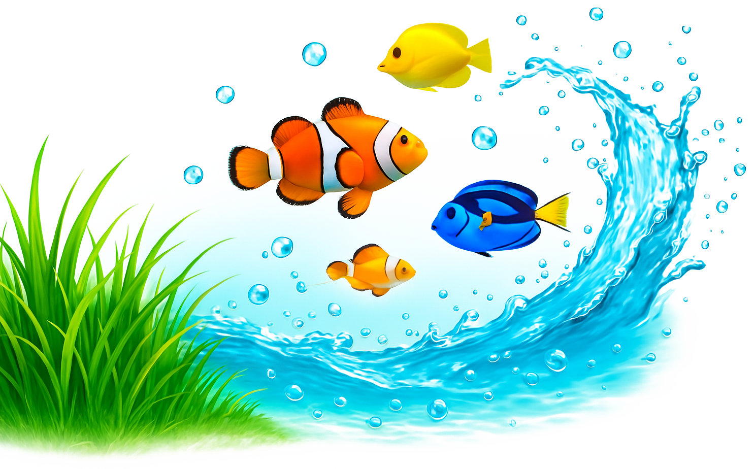
Some of the most common nature elements were bubbles, water, drops, glass, the sky, and auroras.
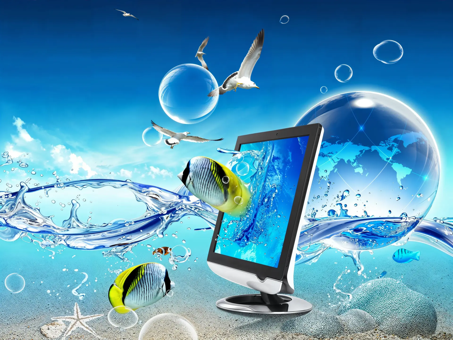
The most common way this aesthetic/style is referred to is Frutiger Aero. Its name comes from the Frutiger font which was extensively used in this style, and Aero comes from the Windows Vista/7 Aero theme which heavily relied on this aesthetic.
Some Frutiger Aero designs were also known for quite prominent usage of water, fish and grass elements in particular, alongside the themes of nature and ecology, which also gave a certain recognisable aesthetic. This particular style was proto-Frutiger Aero and it emerged in mid 2000s, and lasted until the early 2010s.